
A Figma design system is a published Figma library of components, variants, styles and variables. Designers place its components as linked instances, so a published change reaches every file that uses them.
On a team that ships with coding agents, keep that library as a mirror of the component library in code. The agent builds from the repo, and the repo is what ships.
Figma's design systems page calls Figma "The source of truth for design systems". Yet Figma's own agent skill, /figma-generate-library, is listed as "Create new components in Figma from a codebase" (Figma blog).
The sections below cover which copy answers which question, how Figma properties map to code props, where docs live and how to keep both in sync. Building the system itself is covered in the design system guide. For the hands-on part, skip to the five rules for naming Figma properties after code props.
Key takeaways
- Treat the component library in code as the design system and the Figma library as its mirror. Coding agents build from the repo, so the code is what they copy.
- A Figma-only component or variant is a proposal until it merges in code. Nobody can import it before then.
- Name each Figma property and variant value after its code prop and value. Keep interaction states in their own property.
- Sync in one direction, from code to Figma, and compare the two lists of names on every release. Generated Figma libraries still need a check by hand.
What is a Figma design system?
A Figma design system starts with a library. Figma Learn defines one as "a collection of design assets, like components, styles, and variables" (Figma Learn). Publishing the library makes those assets available in other files.
Publishing needs a Professional, Education, Organization, Government or Enterprise plan. The free Starter plan lets you create components and styles, but "you can't publish them in a library to access them in other files" (Figma Learn).
A library component is a main component, and designers place copies of it called instances. "Instances are linked to the main component and receive any updates made to the component" (Figma Learn).
Figma has five kinds of component property: variant, boolean, instance swap, text and slot (Figma Learn). Slots launched in open beta in March 2026 as "flexible areas placed inside main components" (Figma Learn).
Figma Learn describes detaching as: "Remove the link to the original component" (Figma Learn). Publish a change to the main Button, and every linked instance follows it. A detached copy keeps the old look and drifts from that moment.
A published change reaches every linked instance. A detached copy keeps the old look.
6pxSettings
Checkout
Invite
- Detaching removed the link to the main component, so the update never reaches this copy. Library analytics logs each detach per variant.
Example. Publish the library update to see which screens follow the main component.
Figma component library vs the component library in code
The Figma library shows how a component looks in each variant, for the designers placing it. The code library holds what exists, what each prop is called, how the component behaves and what ships.
Some of that has no Figma equivalent. Nathan Curtis writes that "Figma can't express advanced layout and configurations like discriminated unions and other prop relationships" (Nathan Curtis). A Button that needs an href only when it renders as a link is one such relationship.
Behavioral variants are the other gap. An accordion that opens one panel at a time looks the same at rest as one that opens several, so no Figma variant shows the difference. That belongs in a note on behavior beside the component in code.
Take the Button someone detached last sprint to ship a one-off icon. You own the library and found it in review, one of dozens of detached copies across a React and Tailwind product with a dozen engineers shipping into it. Maybe you ran a quarterly audit, or tried Code Connect, Figma's map from library components to code components, on a few of them. The drift came back.
We hear the same thing on our calls with customers: a startup team tried to build a Figma design system that matched its Storybook. Drift arrived in two layers, from the Figma file and from code written around the components instead of with them.
Which copy should your team and its agents trust?
Trust the code for what exists, what it is called and how it behaves. Trust Figma for what the next version should look like.
Figma's page puts design first: "Design systems map to your codebase, so what gets designed is what gets built" (Figma).
The World Food Programme's design system tells its designers the reverse: "If Figma and code disagree, trust the code" (WFP Design System). The same page admits that "The Figma component library is incomplete and significantly out of sync with the code".
On the Syntax podcast, Brad Frost described a design system's Figma library as "a representation of what exists in the coded design system" (Syntax). Nathan Curtis goes further: "A definition extracted untransformed from one party's point-of-view (like a Figma file) is testimony, not a contract" (Nathan Curtis).
Claude Code and Cursor edit the files in the repo and import the components they find there. The Figma MCP server reads a frame only when someone points it at one, with a link or a selection in the desktop app. Figma's docs on structuring files for agents say what happens without Code Connect: "Without it, your agent has to guess which code component matches" (Figma developer docs).
Christine Vallaure puts it in one line: "Code always wins, and Figma is a mirror, not a second truth" (Christine Vallaure).
So a component or variant that exists only in Figma is a proposal. It joins the system when it merges in code. Until then no agent can import it, and no engineer has reviewed its props.
Of five questions about a component, the code answers four: whether it exists, what its props are called, how it behaves and what ships.
The code answers four of the five questions about a component. Figma answers the one about the next version.
- Does this component exist?Codecomponents/ui/
- What are its props and values called?Codethe prop types
- How does it behave?Codethe doc beside it
- What ships today?Codethe main branch
- What should the next version look like?Figmaa proposal in a branch
Design tokens get the same answer, with the theme owning names and values, as the tokens guide on which copy wins explains.
How to map Figma variants and properties to code props
Name every Figma property after the code prop it stands for. Chad Bergman's Design Systems 102 guide on Figma's blog gives the reason: "Creating alignment on how these properties are named ensures smoother handoffs and fewer implementation errors" (Figma blog).
Five naming rules:
- Property name matches prop name. If the Button's prop is
variant, the Figma property is variant too, not Type. - Variant value matches prop value. Type=Primary becomes variant=primary, which reads straight across to
variant="primary". - Interaction states get their own property. Hover, Pressed and Focus are CSS states in code, not props. Keep them in a State property and say so in the description.
- Optional parts are booleans. For an optional icon, Figma Learn says "instead of creating variants for each state, apply a boolean property to the icon's layer visibility" (Figma Learn).
- Content areas are slots. A slot lets designers "add, edit, and rearrange content" inside a component, the job
childrendoes in React (Figma Learn).
Behavioral variants get no Figma property. Write each one into the component description as one line that names the prop and what it does.
Without these rules, variants multiply. A Figma Forum poster asked: "I was wondering if it's really necessary to create all these Variant e.g. for a Tab Bar" (Figma Forum).
Beside its button.tsx, a Figma Button drifts in four places: Type=Tertiary against variant="ghost", Hover and Pressed with no prop, Disabled as a state, a missing Size.
A Figma Button and its code drift in four common places.
PrimarySecondaryTertiaryDefaultHoverPressedDisabledtruefalseSavetype ButtonProps = {variant:| "primary"| "secondary"| "ghost"size: "sm" | "md"disabled?: booleanicon?: ReactNodechildren: ReactNode}
- Different names. Figma says
Type=Tertiary, the code saysvariant="ghost". The code names stay, and the Figma property and value get renamed. - Hover and Pressed are CSS states in code, not props. They can stay in Figma, in a State property the description marks as design only.
- Disabled is a state value in Figma and a boolean prop in code. Make it a boolean property named
disabled. sizeexists only in code. Without a Size property, every Figma Button is the default size.
Example. The component and its values are illustrations of a typical library.
Once the names match, Code Connect can map each Figma property to its prop. The Figma to React guide walks through that mapping for a Button.
Where component docs should live: next to the code, linked from Figma
Write component docs next to the code, so they change in the same pull request as the component. The design system guide shows where instructions live beside the code they govern.
In Figma, each main component gets one line of description and a link to its code doc. Figma shows the description in the Assets panel and in Dev Mode under the component preview. It also searches it: "Figma will look at this description when searching for components" (Figma Learn). Write the line in the words a designer types into search.
Figma is adding one more copy. At Config India in October 2026, Figma put a way to "Add guidelines to your published design libraries" into open beta (Figma Forum). Point those guidelines at the code docs instead of restating them.
Usage, props and examples sit beside the code too, which is how a full set of design system documentation stays current.
How to keep a Figma design system in sync with code
Sync in one direction, from code to Figma. Generate the Figma library from the code library, and send every change that starts in Figma through a pull request first.
We hear the same thing on our calls with customers: an enterprise design-system lead built components with Claude Code and an MCP server, then wrote them into Figma. Design changes that land in code do not get back to Figma. The lead now leans toward code as the source of truth.
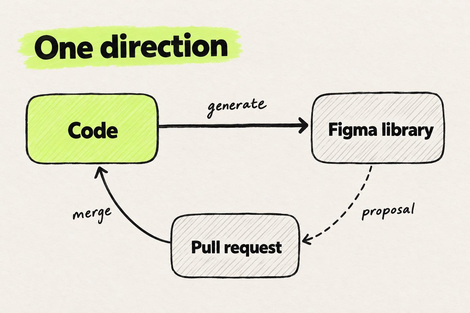
Figma's own skill and story.to.design both generate Figma components from code. Figma's /figma-generate-library skill runs through use_figma, the MCP tool that lets agents create and update Figma components, which launched in beta in March 2026 (Figma blog). story.to.design works from Storybook: "Generate and sync full Figma components from your code" (story.to.design).
Storybook Connect only shows stories. It "is a Figma plugin that allows you to embed component stories in Figma" (Storybook docs).
Check what the generator got wrong
Generated libraries still need checking. Prateek Singh, building a design system from code, writes that "The first real build came out about eighty percent right" (Prateek Singh). Christine Vallaure warns that "Generating the library once is the easy part". Regenerating is harder, because "Deleted variants do not come back. Every variant has a key underneath its name" (Christine Vallaure).
Diff the names on every release, by hand where Figma cannot express a prop relationship. Vallaure compares two JSON lists of components, one from Storybook and one from Figma. A name on one list and not the other is drift, and the code list decides which name stays.
Route proposals through code and watch detaches
Proposals start in a Figma branch and end in a pull request. Branching, on Organization, Enterprise, Government and K-12 Education plans, fits this job: "One popular use case is for maintaining and contributing to style and component libraries" (Figma Learn). When the code change merges, the next generation run brings the variant into the library.
Watch detaches as well. Library analytics, on the same plans, counts them per variant over the last 30 days. "Figma logs a detach any time someone uses the Detach instance setting to break the connection between the instance and the main component" (Figma Learn). A variant people keep detaching is a proposal nobody has filed.
Pasting a Figma frame into a Next.js codebase
Modeinspect works on Next.js React codebases that use Tailwind. A designer pastes a Figma frame onto the canvas beside the running app, drops it on a page, and the coding agent builds it into the code.
Component instances in the pasted frame arrive as plain layers, not linked to the team's code components. Figma variables do not become tokens. The team's React components are found after setup, and agents can place them in the page.
Nothing in the Figma library syncs to code this way.
When Figma-first still makes sense, and how public systems split it
Figma-first still fits a team with no coded foundation and no coding agent in its loop yet, or a product that needs heavy visual exploration. Changying Zheng's case study on moving from Figma-first to code lists where her workflow won't work, including "No code-based design system foundation" and "Products that require heavy visual exploration". In those teams, she writes, "Figma-first might still be your best bet" (Changying Zheng).
GitHub's Primer is Figma-first at scale: "Design teams at GitHub use Figma as the single source of truth, collaboration, and exploration" (Primer).
Atlassian keeps the two in step instead: "Our newest Figma libraries match 1:1 with the React components that developers use" (Atlassian).
shadcn/ui leaves Figma to others: "The Figma files are contributed by the community" (shadcn/ui).
More public design system examples show the range between these four. If the question is whether Figma stays at the center at all, Figma alternatives for product teams compares the options.
Where to start
- List every component in the code library with its props and their values.
- List every Figma component set with its properties and values. Mark each pair as a match, a rename or a one-sided entry.
- Rename the Figma properties and values to match the code, and move Hover, Pressed and Focus into a State property.
- Give every main component a one-line description and a link to its code doc.
- Write the one-direction rule on the library's first page, then regenerate the library and compare the two lists on every release.
Frequently asked questions
Is a Figma library a design system?
Not on its own. A Figma library is a published set of components, styles and variables that designers place as linked instances. A design system also includes the coded components that ship, the tokens they use and the guidance on when to use each. On a team that ships with coding agents, the code library is the system, and the Figma library is a picture of it for designers.
How do you build a design system in Figma?
If a code library exists, start from it. List its components and props, build a Figma component set for each with matching property names, and publish the file as a library. Give every main component a description and a link to its code. Without a code library, our design system guide starts one in code. Figma-first fits only a team with no coding agents yet, or a product that needs heavy visual exploration.
Which Figma plan do you need for a design system library?
Publishing a library needs one of these Figma plans: Professional, Education, Organization, Government or Enterprise (Figma Learn). On the free Starter plan you can create components and styles, but you cannot publish them for use in other files. Branching and library analytics, which counts detaches, need Organization, Enterprise, Government or K-12 Education. Code Connect needs Professional, Organization, Government or Enterprise (Figma Learn).
How do you keep a Figma component library in sync with code?
Sync in one direction, from code to Figma. Generate the Figma components from code with Figma's /figma-generate-library agent skill or story.to.design. On every release, compare a list of component names from code with one from Figma. Send any new Figma variant to a pull request first, and add it to the library once it merges. Watch library analytics for variants people keep detaching.
Should Figma variants match code props?
Yes. Name each Figma property after the code prop it stands for, and each variant value after the prop's value, so Type=Primary becomes variant=primary. Keep Hover, Pressed and Focus in a separate State property, because code handles them as CSS states. Use booleans for optional parts and slots for content areas. Matching names let Code Connect and coding agents find the right prop.
Do Figma slots replace variants?
Partly. A slot is a flexible area inside a main component where designers add, edit and rearrange content, much like children in React. Slots replace variants that only existed to hold different content, such as a card with one, two or three rows. Visual options such as primary and secondary still need a variant, because each maps to a prop value. Slots launched in open beta in March 2026.
What happens when you detach an instance in Figma?
Detaching removes the link between an instance and its main component. The copy keeps its current look, but later updates to the main component no longer reach it, so it drifts. On Organization, Enterprise, Government and K-12 Education plans, library analytics logs each detach per variant over the last 30 days. A variant that people keep detaching usually needs a change in the code library.
Can Figma generate components from code?
Yes, with limits. Figma's /figma-generate-library agent skill creates components in Figma from a codebase, and story.to.design generates Figma components from Storybook. Storybook Connect only embeds stories in Figma. Generated libraries need checking: Prateek Singh found his first real build came out about eighty percent right, and Christine Vallaure warns that deleted variants do not come back.