The design system examples worth learning from are the ones whose code you can read. Primer, Fluent 2, Spectrum, Carbon, Ant Design and shadcn/ui hold up best. Judge them, and your own, on what a coding agent reads: typed props, tokens, theming in tokens and docs beside the code. New to the term? Start with our guide to creating a design system.
The ranking lists judge something else. Figma's resource library, UXPin and designsystems.surf show each system's website, the pages a person browses. None of them compares a Button prop across systems or mentions llms.txt or MCP servers. None says that Polaris React is archived or that Material Web is in maintenance mode.
A coding agent working in your repo does not open those websites. It reads the package, so study the repo, not the website. The scorecard of all ten shows what each one publishes.
Key takeaways
- Judge a public design system by its package, not its website. An agent reads the types, tokens and docs beside each component.
- Strong systems make each visual decision one typed prop and switch dark mode once, at the root, through tokens.
- Material Web is in maintenance mode and Polaris React is archived, so two packages from the most-listed systems are poor models for new code.
- Copy patterns, not packages. Some systems are licensed only for products on their platforms, and "when not to use" guidance prevents drift that types cannot.
How to judge a design system example by what an agent reads
You are probably the design lead or design engineer on a React and Tailwind codebase. Your agent keeps building its own Button. You have already pointed it at a docs site, a Figma library or a famous system to imitate, and it still writes new components.
Those are pictures of a system. The agent reads the repo: type definitions, the token file, the comment above each component. Judge a public system by what its package puts there.
Five criteria decide what an agent can use:
- Published code. Components ship as a package or as source, under a license you can use.
- Typed props. Each visual decision is one prop with a closed list of values, such as
variant: 'primary' | 'danger'. - Tokens. Colors, spacing and type have names an agent can use instead of raw values.
- Theming in tokens. Dark mode changes token values once, at the root, so no component mentions a theme.
- Docs beside the code. Usage guidance sits in the repo next to the component, not only on a website.
The scorecard adds one more column for agent material: llms.txt files and MCP servers, which help an agent look things up. For your own library, see MCP servers for your design system.
Judged on those five, two packages from the most-listed systems, Material Web and Polaris React, are poor models for new React code.
Ten design system examples, compared
The scorecard compares ten examples of design systems on what each publishes, column by column.
| System | Package | Typed props | Tokens | Themes in tokens | Docs beside code | For agents (November 2026) |
|---|---|---|---|---|---|---|
| Primer | React, MIT | Yes, variant | Yes, CSS variables | Yes, 9 themes set by data attributes | Yes, a docs file per component | MCP server |
| Fluent 2 | React, MIT | Yes, appearance | Yes, typed theme objects | Yes, a provider at the root | Yes, best practices in the repo | llms.txt |
| Spectrum 2 | React, Apache-2.0 | Yes, variant and fillStyle | Yes, JSON and a style macro | Yes, light and dark through a provider | Yes, docs in the same repo | llms.txt and MCP server |
| Carbon | React, Apache-2.0 | Yes, kind | Yes, token files per theme | Yes, 4 themes, one class each | Partly: stories in the repo, guidance on the website | llms.txt and MCP server (IBMid sign-in) |
| Atlassian | React, limited license | Yes, appearance | Yes, a token() function | Yes, a data attribute | Partly: guidance on the website | llms.txt and MCP server |
| Ant Design | React, MIT | Yes, type, variant and color | Yes, typed JS tokens | Yes, a dark algorithm through a provider | Yes, docs and demos in the component folder | llms.txt and MCP server |
| shadcn/ui | Source in your repo, MIT | Yes, variant | Yes, your CSS variables | Yes, a .dark class | Partly: docs stay on shadcn's site | llms.txt and MCP server |
| GOV.UK | Sass and Nunjucks, MIT | No, a class string without types | Yes, a Sass function | No themes | Partly: docs in a separate repo | None found |
| Material Web | Web components, maintenance mode | Partly: one tag per style | Yes, CSS variables | No, you generate a scheme | Yes, docs in the same repo | None found |
| Polaris | Web components, React archived | Yes, variant and tone | No, not for app code | No, it follows the Shopify admin | Partly: docs on shopify.dev | Shopify Dev MCP |
Seven systems ship typed React components, named tokens and themes in tokens: Primer, Fluent 2, Spectrum, Carbon, Atlassian, Ant Design and shadcn/ui. Carbon and Atlassian keep usage guidance on their websites, and a copied shadcn/ui component leaves its docs on shadcn's site. GOV.UK ships Sass and Nunjucks macros with no types and no dark mode. Material Web is in maintenance mode and leaves the theme for you to generate. Polaris React is archived, and its replacement follows the Shopify admin's appearance.
Primer: nine themes, switched by data attributes
Primer, GitHub's design system, switches nine themes at the root of the page: "There are three distinct data-attributes used to handle theming: data-color-mode, data-light-theme, and data-dark-theme" (Primer docs). Its React package, @primer/react, ships under MIT with types.
Button's style is one typed prop, variant, with five values: default, primary, invisible, danger and link. Colors come from @primer/primitives as CSS variables such as --bgColor-default.
Beside Button.tsx sit Button.docs.json, stories and a Code Connect file. The @primer/mcp server "helps AI agents understand and use Primer's design system correctly" (Primer MCP).
Copy: a machine-readable docs file beside each component, matching the props table people read.
Fluent 2: one provider sets every token
Fluent 2 sets every token from one component: "Place a <FluentProvider /> at the root of your app and pass a theme to the theme prop" (Fluent theming docs). Microsoft's React library for it, @fluentui/react-components, is MIT-licensed TypeScript (Fluent UI repo).
Button's style is appearance: secondary by default, or primary, outline, subtle and transparent. Tokens are typed theme objects with names like colorNeutralBackground1, and themes such as webDarkTheme go in through the provider. The theming doc also warns: "Never use theme CSS variables directly!"
ButtonBestPractices.md and ButtonDescription.md live in the same repo as the component.
Copy: one provider at the root that sets every token, so no component has to know the theme.
Spectrum: styles locked inside the component
Spectrum keeps colors and padding out of reach: "Other styles such as colors and internal padding cannot be customized within Spectrum components" (React Spectrum styling). Adobe's React implementation ships Spectrum 2 as @react-spectrum/s2, under Apache-2.0 with TypeScript types.
Button splits style into two typed props: variant, from primary to genai, and fillStyle, either fill or outline. Tokens such as background-base-color reach components through the style macro.
Every docs page also exists as Markdown, next to an llms.txt, an MCP server and a "Working with AI" page.
Copy: lock colors and padding inside the component, so an agent changes props instead of restyling.
Carbon: four named themes, one class each
Carbon switches between four named themes with one component: <Theme theme="g100"> adds the class cds--g100. The themes are white, g10, g90 and g100. IBM ships @carbon/react under Apache-2.0 with types (Carbon README).
Button's style prop is kind, and some values encode two decisions, such as danger--ghost. Tokens like $background compile to var(--cds-background).
Stories and Button.mdx sit beside Button.tsx, but guidance such as "Do not use buttons as navigational elements" lives on the website. The Carbon MCP server "connects your AI client to the Carbon Design System", and it signs in with IBMid.
Copy: short theme names in code that map one to one to the names designers use.
Atlassian: every token through one function
Atlassian routes every token through one function: "The token() function takes a dot-separated token name and returns a valid CSS custom property" (Atlassian tokens). So token('color.background.neutral') returns var(--ds-background-neutral), and setGlobalTheme switches themes with data-theme on <html>. @atlaskit/button ships with types.
Button's style is appearance, with values from default and primary to warning and discovery.
The license grants use for software "that interoperate or are integrated with Atlassian's software and cloud products and apps" and forbids modifying or adapting the system.
Study: how one token() call turns a design token name into a CSS variable.
Ant Design: three props for one button
Ant Design hands coding agents a prompt of its own: a For Agents page offers "a ready-to-use prompt". The "enterprise-class UI design language and React UI library" (README) ships antd under MIT with typings.
Button has three style props: variant (outlined, solid, text and more), color and type. The docs explain the overlap: "Type is essentially syntactic sugar for colors and variants" (Button docs). Tokens are typed JavaScript, such as colorBgContainer, set through ConfigProvider, where theme.darkAlgorithm turns on dark mode.
Docs and demos sit beside Button.tsx.
Copy: shape and meaning as two props, variant and color, without a shortcut prop that mixes them.
shadcn/ui: the source lives in your repo
shadcn/ui copies each component's source into your repo: npx shadcn@latest add button writes the Button file you then own. What that means for your own system is in what a shadcn design system is.
Button's variant is a cva list: default, destructive, outline, secondary, ghost and link. Tokens are your own CSS variables, --background and --foreground, because "We use semantic background and foreground pairs" (theming docs). "Dark mode works by overriding the same tokens inside a .dark selector."
The catch: once copied, a component lives in your repo without its docs page.
Copy: name tokens in background and foreground pairs, so each surface comes with its text color.
GOV.UK: no types, and the guidance that stops drift
The GOV.UK Design System tells you when not to use a component, and it ships no types. Built "for everyone that works on government services" (GOV.UK Design System), govuk-frontend ships Sass, JavaScript and Nunjucks macros, with no dark mode.
A button's style is a class string passed to the govukButton macro, such as classes: "govuk-button--secondary". Colors come from the govuk-functional-colour Sass function, and the colour page says "Do not copy the specific hexadecimal (hex) colour values".
It scores lowest in the table. Its guidance is the part worth copying. The accordion page has a section headed "When not to use this component", which opens: "Accordions hide content from the user." No column in the scorecard measures that.
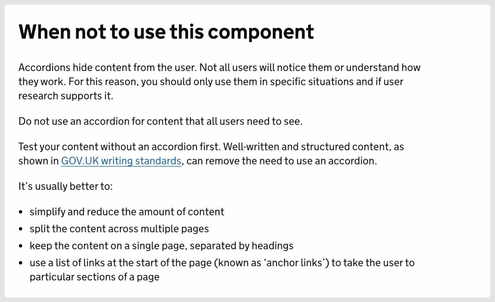
GOV.UK Design System guidance is published under the Open Government Licence v3.0.
Copy: a "When not to use" section in every component's docs, written where the agent reads it.
Material Web: in maintenance mode
Material Web's README describes "a library of web components that helps build beautiful and accessible web applications" and then says "MWC is in maintenance mode pending new maintainers" (README). Discussion #5642 adds: "New features and components are no longer planned."
Button style is the tag: md-filled-button, md-outlined-button, md-text-button and two more. Tokens are CSS custom properties such as --md-sys-color-surface. No themes ship: you generate a color scheme with Material's theme builder.
Study: how its tokens theme every component as CSS custom properties, and build on a maintained package instead.
Polaris: the React library is archived
The Polaris React README says: "This repository is archived and unmaintained." The repository was archived in September 2026. Polaris now ships as web components from Shopify's CDN, and "Polaris Web Components 2.0 is now available on the stable Polaris CDN channels" (Shopify changelog). Types come from @shopify/polaris-types.
<s-button> takes variant, from auto to tertiary, and a separate tone, such as critical. Version 2.0 follows the Shopify admin's appearance, so the app does not choose a theme.
The README also "restricts Polaris usage to applications that integrate or interoperate with Shopify software or services".
Study: variant and tone as separate props, so emphasis and meaning stay two decisions.
Design system components: one decision, many names
A button's visual style is the same decision in every system, and the ten systems do not agree on its name.
A button's visual style is the same decision in all ten systems, under different prop names and values.
- Primervariant
<Button variant="danger">default, primary, invisible, danger, link - Fluent 2appearance
<Button appearance="primary">secondary, primary, outline, subtle, transparent - Spectrum 2variant, fillStyle
<Button variant="negative" fillStyle="outline">primary, secondary, accent, negative, premium, genai - Carbonkind
<Button kind="danger--ghost">primary, secondary, tertiary, ghost, danger, danger--primary, danger--tertiary, danger--ghost - Atlassianappearance
<Button appearance="danger">default, primary, subtle, warning, danger, discovery, rovo - Ant Designtype, variant, color
<Button color="danger" variant="solid">variant: outlined, dashed, solid, filled, text, link - shadcn/uivariant
<Button variant="destructive">default, destructive, outline, secondary, ghost, link - Polarisvariant, tone
<s-button variant="primary" tone="critical">auto, primary, secondary, tertiary - GOV.UKclasses
govukButton({ classes: "govuk-button--secondary" })govuk-button--secondary, --warning, --inverse - Material Webthe tag
<md-outlined-button>elevated, filled, filled-tonal, outlined, text
Prop names and values as published in each system's Button source or docs. Ant Design's type is a shortcut for variant and color.
Primer, Spectrum, shadcn/ui and Polaris call it variant. Fluent and Atlassian call it appearance, and Carbon calls it kind. Ant Design accepts type, variant and color. GOV.UK passes a class string, and Material Web makes each style a separate tag.
The values differ too. The destructive button is danger in Primer, Carbon and Atlassian, negative in Spectrum, destructive in shadcn/ui and a critical tone in Polaris.
Your library needs one name for this decision on every component, with a closed list of values. An agent that reads variant: 'primary' | 'ghost' picks a value. Given a free string, it has to guess. To check your own props, run an audit of your component props and tokens.
Theme switching across the ten examples: attribute, class or provider
Seven of the ten put dark mode in tokens and switch it once, at the root. Their components never name a theme.
Seven systems switch the theme once, at the root, and the components read the same token names in every theme.
- Primer
data-color-mode="dark"Surface--bgColor-defaultText--fgColor-default - Atlassian
setGlobalTheme() sets data-themeSurface--ds-surfaceText--ds-text
- Carbon
<Theme theme="g100"> adds cds--g100Surface$backgroundText$text-primary - shadcn/ui
<html class="dark">Surface--backgroundText--foreground
- Fluent 2
<FluentProvider theme={webDarkTheme}>SurfacecolorNeutralBackground1TextcolorNeutralForeground1 - Spectrum 2
<Provider colorScheme="dark">Surfacebackground-base-colorTextneutral-content-color-default - Ant Design
<ConfigProvider theme={{ algorithm: theme.darkAlgorithm }}>SurfacecolorBgLayoutTextcolorText
From each system's theming docs: Primer, Atlassian, Carbon, shadcn/ui, Fluent, React Spectrum, Ant Design.
The switch takes three forms. Primer and Atlassian set data attributes, data-color-mode and data-theme among them. Carbon and shadcn/ui set a class, cds--g100 or .dark. Fluent, Spectrum and Ant Design wrap the app in a provider.
Underneath, the surface token has a different name in each: --bgColor-default in Primer, colorNeutralBackground1 in Fluent, $background in Carbon and --background in shadcn/ui.
Tokens themselves are explained in our design tokens guide. For theme switching in your own codebase, read semantic tokens for theming and dark mode.
What to copy from these design system examples
Start with your own Button and work outward.
- Open the Button's props. Give each visual decision its own typed prop with a closed list of values, like Primer's
variantor Polaris'svariantandtone. - Search components for hex values and
dark:color utilities. Replace each with a semantic token pair, like shadcn/ui's--backgroundand--foreground. - Move the theme switch to the root: one data attribute, class or provider.
- Add a "When not to use" section beside your five most-used components, the way GOV.UK does for its accordion. The format is in design system documentation for people and agents.
- Check the license before you install anything. Atlassian and Polaris are for products that integrate with their platforms.
A Figma library should mirror the code. Keeping a Figma design system in step with code shows how.
Then open the repository of the system closest to your stack, read its Button folder file by file, and copy the one pattern your Button lacks.
Frequently asked questions
What is an example of a design system?
A design system example is a public system you can study in code, such as GitHub's Primer. It ships React components in @primer/react, tokens as CSS variables in @primer/primitives, nine themes and docs files beside its components. Other public examples with readable code include Microsoft's Fluent 2, Adobe's Spectrum, IBM's Carbon, the Atlassian Design System, Ant Design, shadcn/ui and the GOV.UK Design System. Each pairs its components with named tokens, and most add usage guidance on their docs sites.
What are the most popular design systems?
The systems that ranking pages list most often are Material, Carbon, Polaris, Atlassian, Apple's Human Interface Guidelines, Fluent, Salesforce Lightning and Spectrum. Popular does not mean current. Material Web, the web components for Material Design, is in maintenance mode. The Polaris React library was archived in September 2026, and Polaris now ships as web components. Of the popular ones, Carbon, Fluent, Spectrum and Atlassian are also strong examples in code, with typed React components and themes in tokens. Atlassian's license limits who can install it.
What are the top 5 design systems?
Judged on what a coding agent reads, the best design systems to learn from are GitHub's Primer, Microsoft's Fluent 2, Adobe's Spectrum, IBM's Carbon and Ant Design. All five ship typed React components, named tokens and themes made of tokens, under MIT or Apache-2.0 licenses. shadcn/ui is the sixth candidate if you want the source in your own repo. Atlassian and Polaris are licensed only for products that integrate with their platforms.
How do design system components differ across these examples?
Every system here ships a Button, which makes it the clearest component to compare. Its visual style is the same decision under different names: variant in Primer, Spectrum, shadcn/ui and Polaris, appearance in Fluent and Atlassian, and kind in Carbon. Ant Design splits it across type, variant and color. GOV.UK uses a class string and Material Web a separate tag per style. For the parts every system shares, see what a design system is made of.
Is Material Design still maintained on the web?
Material Web, the @material/web library of web components, is in maintenance mode. Its README says "MWC is in maintenance mode pending new maintainers". Discussion #5642 on its GitHub repository adds: "MWC is not deprecated or going away, but Material Design is no longer actively staffing its development." It also says "New features and components are no longer planned."
Is Shopify Polaris deprecated?
The React library is. Its README says "The Shopify Polaris React library is deprecated", and the repository was archived in September 2026. Polaris continues as web components loaded from Shopify's CDN, with types in @shopify/polaris-types. Polaris Web Components 2.0 went stable in October 2026. Their theme follows the appearance of the surrounding Shopify admin.
Can I use Atlassian's or Shopify's design system in my own product?
Only if your product integrates with their platform. Atlassian's license grants use for software "that interoperate or are integrated with Atlassian's software and cloud products and apps", and it forbids modifying or adapting the system. The Polaris README "restricts Polaris usage to applications that integrate or interoperate with Shopify software or services". For any other product, study their patterns and build your own components.
Which design systems publish an MCP server or llms.txt?
Spectrum, Carbon, Atlassian, Ant Design and shadcn/ui publish both. Carbon's MCP server signs in with IBMid, and Ant Design's runs through @ant-design/cli. Fluent 2 publishes an llms.txt with a text file per component. Primer publishes an MCP server, @primer/mcp, but no llms.txt. Shopify's Dev MCP covers Polaris. GOV.UK and Material Web publish neither.