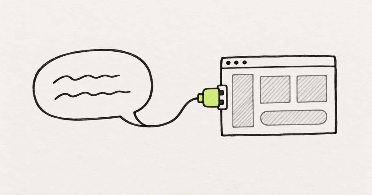
Vibe design means designing an interface by telling an AI tool what you want, in words, a sketch or a reference, and steering what it draws. You direct the result. The tool places the pixels or writes the code.
The term is the design sibling of vibe coding, and it has a catch. A vibe is a relative instruction. "Calmer", "denser" and "more like the rest of the app" only mean something next to a product that already exists.
That is why vibe design holds up on the real product and falls apart in an empty project. This guide covers what the term means, where its output lands, and six prompts to copy.
Key takeaways
- Vibe design is directing UI by describing the outcome to an AI tool and steering what comes back. Vibe coding is the same move with running code as the output.
- The term followed vibe coding by a month and became a product term a year later. Not every vendor uses the word, and the tools under it range from canvas mockups to working apps.
- A vibe is a relative instruction. In an empty project the prompt has to describe your whole product. On the real codebase it only has to name what is already there.
- Good prompts for UI name the place, the change, the parts to reuse, the limits and the check. Small visual changes are faster by hand than by prompt.
What is vibe design?
Framer's dictionary defines vibe design as directing "the look, feel, and layout of a user interface" through prompts and AI tools, instead of adjusting every detail by hand.
Jakob Nielsen defined it a month after vibe coding got its name. In Vibe Coding and Vibe Design, he described it as "focusing on high-level intent while delegating execution to AI".
The difference between vibe design and vibe coding is the output. Vibe design ends in screens: a mockup, a set of variations, a clickable prototype. Vibe coding ends in running code.
Neither word says where the output lands. A new canvas file, a new app and your team's repository are three different places, and only the last one is your product.
Where the term "vibe design" came from
Andrej Karpathy coined vibe coding in a post on X in February 2025. He described a way of working where you "fully give in to the vibes" and "forget that the code even exists".
His example of a request was a design change: "decrease the padding on the sidebar by half". He also scoped the method himself, to "throwaway weekend projects".
Nielsen's article applied the idea to UX a month later. In May 2025, Google launched Stitch with a prompt guide that has a section called "Set the Vibe with Adjectives". In November 2025, Collins Dictionary made vibe coding its word of the year.
The design term became a product term in March 2026, when Google published Introducing "vibe design" with Stitch. Rustin Banks, a product manager at Google Labs, wrote that a designer can now start from "what you want your users to feel" instead of a wireframe.
Vibe design was in print a month after vibe coding, and became a product term a year later.
- Feb 2025Andrej Karpathy
coins “vibe coding” in a post on X
- Mar 2025Jakob Nielsen
publishes “Vibe Coding and Vibe Design”
- May 2025Google Stitch
launches with a prompt guide: “Set the Vibe with Adjectives”
- Nov 2025Collins Dictionary
names vibe coding its word of the year
- Mar 2026Google Labs
publishes “Introducing ‘vibe design’ with Stitch”
Not every vendor took the word. Figma calls the same activity vibe coding, and its resource library says it "works best for early exploration and mid-fidelity iteration" (Figma).
Simon Willison drew the line between vibe coding and using AI to write code. For him, vibe coding means building software with a model "without reviewing the code it writes". Review is the part a product team cannot skip.
Vibe design tools: three places the output lands
The tools differ less in how you prompt them than in where the result ends up.
| Where it lands | Tools | What you get back |
|---|---|---|
| A canvas file | Google Stitch, Figma Make, Claude Design | Screens and a prototype that still have to be moved into the product |
| A new app | v0, Lovable, Bolt | A running app in its own project |
| Your repository | Cursor Design Mode, Claude Code, Onlook, Modeinspect | A code change an engineer reviews |
Stitch generates UI on an infinite canvas and exports it to developer tools. Figma Make turns a prompt into a functional prototype in a Make file. Claude Design hands the build to Claude Code, and Claude Design and its alternatives are compared separately.
The app builders differ in how they treat a repository you already have. v0 can open a pull request on it, Bolt commits to it, and Lovable only syncs to a new one. Our comparison of prototyping tools for product teams covers them.
In the last row, Cursor Design Mode and Claude Code edit the code your product ships from, and Onlook syncs visual edits to a React codebase. Modeinspect puts a design canvas on the running app, where you prompt for options, adjust them with design controls and open a pull request. It supports Next.js React codebases that use Tailwind.
Prices, limits and the full list are in AI tools for designers, sorted by where the output lands.
Why vibe design only works on the real product
A vibe prompt leaves almost everything unsaid. "Make the billing page calmer" does not name a color, a type size, a spacing scale or a component. The tool has to fill those in from somewhere.
In an empty project it fills them in from the average of everything it has seen. You get a clean, plausible screen that belongs to no product in particular. The rounded cards and soft gradients are the model's vibe, and yours never made it in.
One sentence, two landings: an empty project has to invent the values, your codebase already has them.
“Make the billing page calmer.”
bg-[#F3F0FF]rounded-[20px] p-[22px]<PlanCardV2 />
bg-surfacerounded-lg p-4<Card />
- A color the model picked. The theme has no such value.
- A radius and a padding that match no step on the scale.
- A new component, where your product already has a Card.
The vendors know this, and the canvas tools answer it with a file that describes your product to the model. Stitch has DESIGN.md, which Google calls "an agent-friendly markdown file" for design rules. Figma Make reads a guidelines file "automatically as part of its context on every prompt" (Figma Help Center).
They are also moving toward the product itself. Stitch now lets you "bring existing codebase and design files" as a starting point (Google). Claude Design has a command that pulls in your design system, so a design "starts from your existing components" (Claude Help Center).
A description file is a copy of the product, written out in markdown. The codebase is the original. It already holds the theme, the components and the data. A coding agent working there still reads a rules file such as CLAUDE.md, for the conventions the code does not state.
You design for a product with its own components, and you already tried the prompt-to-app route. Your Lovable prototype won the review, and then an engineer told you it would be faster to rebuild it than to merge it. The three rungs from product designer to design engineer explain why that happens.
On the real product the same prompt reads differently. "Calmer" now has a spacing scale to pick from, a Card to reuse and a billing page to compare against. An agent can still invent a value there, and prompt 5 below catches it. On the real product the screen is the code, so vibe design ends in a diff too. An engineer reviews it like any other change.
The claim stops in two places. With no product yet, or with a brief to find a new visual direction, a blank canvas is the right place. There is nothing to anchor to, and Stitch is built for exploring dozens of directions.
The second place is the small change. We hear the same thing on our calls with customers: designers hate prompting for small visual changes and would rather make them by hand. Figma's guide to Make credits says the same: "Not every change requires a prompt." For color, corner radius, spacing and typography, it recommends editing the element directly.
Prompt engineering for designers: what goes in the prompt
Most of the work is saying what the tool cannot see. The vendors' own guides agree on three habits.
- Front-load the first prompt. Figma's tips for Make list five details: the task, the context, key design elements, expected behaviors and constraints.
- Keep each follow-up small. The Stitch prompt guide says to "make one or two adjustments per prompt". Tammy Taabassum, a product designer at Figma, says in Figma's tips for Make: "The smaller the scope, the more detailed the LLM can be."
- Point at what exists. Claude Code's best practices say to name the file and "say what 'fixed' looks like". Their example prompt says to "follow the pattern in" an existing file.
On a real product those habits become five parts: the place, the change, the parts to reuse, the limits and the check. Each one names something instead of describing it.
A prompt for UI on a real product names five things. The vibe is only one of them.
“Make the billing page calmer.”
- Place
On
/settings/billing, inPlanCard.tsx, - Change
give the plan details more room.
- Reuse
Use spacing from our theme and the existing
Card. - Limits
No new components, no values in square brackets.
- Check
Show me the diff and a screenshot at 375px.
An example. The route, the file and the component stand in for your own.
Prompting AI for UI design runs from a blank canvas to a reviewed diff, and the six prompts below follow that order. Fill in the brackets. For the decisions around the screen, see prompts for each product design decision. Our UX guide has a prompt that designs every state of a flow.
1. Start a screen on a blank canvas
For Stitch, Figma Make or Claude Design, when there is no product to work on yet.
Design [screen] for [product, one sentence] on [desktop web / iOS].
Who uses it: [role], who comes here to [the one job].
On the screen: [3 to 5 elements, most important first].
When the user [action], [what happens].
Feel: [two adjectives]. Closest reference: [product or attached image].
Limits: [one accent color], [one type family], no gradients,
no illustrations.
Give me three layouts that differ in structure, not in color.
2. Turn a vibe into named changes
For a coding agent that has your repository open. It turns the adjective into a list you can accept line by line.
[Screen or route] feels [cramped / noisy / flat]. I want it [calmer].
Do not change any files yet.
List up to six changes that would get there.
Use only spacing, color and type values from our Tailwind theme
and components that already exist.
For each change, give the element, the current class and the new class.
Say which change you would make first, and why.
An example of what comes back, for a billing page:
1. Plan card: p-4 -> p-6
2. Gap between plan cards: gap-3 -> gap-6
3. Invoice table header: text-fg -> text-fg-muted
First: 2. The cards read as one block at gap-3.
3. Build a new section from parts that exist
For a coding agent on your repository, when the screen needs something it does not have yet.
Add [an empty state] to [screen or route].
Follow the pattern in [file of a similar section].
Use [EmptyState], [Button] and the icons we already import.
No new components, no new colors, no values in square brackets.
Copy: [headline], [one line], [button label].
If a part is missing, stop and tell me instead of creating it.
4. Make one small change, by name
Name the element, the breakpoint and the token. If you can make the change with a design control, do that instead.
In [component file], change the padding of [the card]
from p-4 to p-6 at the md breakpoint and up.
Change nothing else. Show me the diff.
5. Check the diff for invented values
Run this after any prompted change, before you ask for a review. Tailwind writes one-off values in square brackets, such as p-[22px].
Read the diff on this branch.
List every value that is not from our Tailwind theme:
hex colors, values in square brackets, inline styles.
List every new component that duplicates one we already have.
For each, give the file, the line and the closest existing token
or component. Do not fix anything yet.
6. Ask for the evidence
For an agent that can run the app, such as Claude Code with its Browser pane. The screenshots go into the pull request.
Run the app and open [route] at 375px and 1280px wide.
Take a screenshot of each.
Tell me what changed on screen compared with main, in one list.
Then run the project's checks and paste the results.
If you ask for this on every change, install it once. Two of our design engineer skills, open source for Claude Code, Cursor and Codex, do the work. visual-qa-branch compares your branch against main, route by route, across hover, focus, dark mode and narrow widths. reviewable-ui-pr captures before and after screenshots per width and theme and drafts the pull request.
Vibe coding for designers: where it stops
It stops at review. Karpathy's version accepts every change without reading it, which suits a weekend project and no team codebase.
A designer does not have to read every line to stay on the right side of that. Keep each change to one screen. Read the list of changed files. Run prompt 5 on the diff, look at the running result, and send it to an engineer as a pull request. What Claude Code is good for in a designer's hands walks through that loop.
What to do this week
- Pick one screen in your product that feels off, and write the vibe down in one sentence.
- Run prompt 2 on it, in whichever tool has your repository open. If none does, ask an engineer for read access first.
- Accept two of the listed changes, and make the smallest one by hand if your tool has design controls.
- Run prompts 5 and 6, then open a pull request with the two screenshots.
Frequently asked questions
What does vibe design mean?
Vibe design is designing an interface by describing the outcome to an AI tool and steering what it produces, instead of placing every element by hand. The input can be a sentence, a sketch or a reference. The output is screens, variations or a prototype.
What is the difference between vibe design and vibe coding?
The output. Vibe design ends in screens and prototypes, and vibe coding ends in running code. Andrej Karpathy coined vibe coding in February 2025 for prompting without reading the code. On a product that exists, the screen is the code, so both end in the same place: a diff.
Who coined the term vibe design?
Jakob Nielsen used it in March 2025, in his article Vibe Coding and Vibe Design, a month after Karpathy's post on vibe coding. Google made it a product term in March 2026, when it announced a new version of Stitch under the headline Introducing "vibe design" with Stitch.
What are the best vibe design tools?
It depends on where the output has to land. Google Stitch, Figma Make and Claude Design produce a canvas file. v0, Lovable and Bolt produce a new app. Cursor Design Mode, Claude Code, Onlook and Modeinspect change the repository your product ships from. Our roundup of AI tools for designers has prices and limits for each.
What is prompt engineering for designers?
It is writing prompts that tell an AI tool what it cannot see. For UI, that means five things: the place, the change, the parts to reuse, the limits and the check. Name real components and tokens instead of describing them, and keep each follow-up to one or two changes.
How do you prompt AI for UI design?
Start with the screen, the user and the one job the screen does. List the elements in order of importance and name what happens on each action. Give two adjectives and one reference for the feel. On an existing product, replace the adjectives with your own component and token names.
What is the fastest way to turn a prompt into a working prototype?
For a new idea, a prompt-to-app builder such as v0, Lovable or Bolt gets you a running app from one prompt. For a change to a product that exists, prompt a tool that works on your repository, so the prototype uses your components and data. Our comparison of prototyping tools covers both routes.
Does building from prompts speed up how teams ship?
It speeds up exploring and building. It does not speed up review, which becomes the bottleneck when prompted changes are large. Small changes built from your own design system are easier to review. How teams ship front-end changes faster with AI covers why.