A low fidelity prototype is a rough model of a design: a paper sketch, a grey wireframe, or a few clickable boxes. It tests whether an idea and its flow make sense. A high fidelity prototype looks and behaves like the finished product, so it can test workflow, detail and buy-in. Build low when the question is about concept or structure and several directions are still open. Build high when the question is how it behaves, how long a task takes, or whether someone will fund it.
There is a third case. If you are changing a product that already exists, a prototype on the real codebase starts with the product's real components and real data around it. You can often skip the polished mockup and prototype in code. The tools for each route are compared in our guide to prototyping tools, from Figma click-throughs to your real codebase.
Key takeaways
- Low and high fidelity prototypes uncover about as many usability problems, but not the same kinds (Walker, Takayama and Landay).
- Fidelity is several dials, not one. Lim, Stolterman and Tenenberg treat data as its own dimension, and list "realistic versus faked data" under fidelity (TOCHI paper).
- High fidelity was more expensive to develop, and it needed a designer who could also program. In 1996, Rudd, Stern and Isensee wrote that such people were hard to find (interactions).
- On an existing product, a prototype on the real codebase starts with the product's real data. After Prelude began prototyping on its own codebase, idea to merged pull request fell from about 31 days to 13 (Prelude case study).
What low fidelity and high fidelity mean
In product design (not lo-fi music), fidelity is how close a prototype comes to the finished product. Kara Pernice of Nielsen Norman Group defines it as "how closely it matches the look-and-feel of the final system" (NN/g).
Rudd, Stern and Isensee, writing from IBM in interactions, defined both ends. Low fidelity prototypes "are constructed to depict concepts, design alternatives, and screen layouts, rather than to model the user interaction with a system." High fidelity prototypes "are fully interactive", and people "interact with the user interface as though it were a real product" (ACM).
Common forms at each end:
- Low fidelity: paper sketches, whiteboard flows, grey-box wireframes linked into a click-through, and paper sessions where a teammate plays the computer and swaps screens by hand.
- High fidelity: a Figma prototype with final visuals, a dedicated interaction tool such as ProtoPie, and a coded prototype that runs in a browser.
Low fidelity wireframe vs low fidelity prototype
A low fidelity wireframe shows structure. A low fidelity prototype is something a person uses to try a task.
Huei-Hsin Wang's NN/g glossary defines a wireframe as "a skeletal outline of a design layout" that represents structure and functionality "before visual design is considered." A prototype is "an early version of a design used to test and validate ideas, interactions, and functionality" (NN/g).
Low fidelity wireframes are usually grey boxes, placeholder text and simple lines, with no colour, imagery or final copy. The same grey boxes can be either thing. They become a prototype the moment someone uses them to attempt a task. "Lo fi prototype" is a shorter name for a low fidelity prototype.
Fidelity is several dials, not one
A prototype can be polished in one respect and rough in another. The useful question is which dials the current question needs turned up.
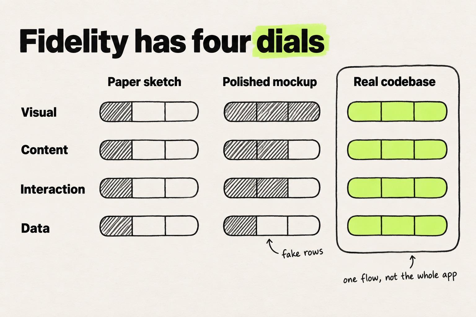
Pernice's NN/g article names three: interactivity, visuals, and content and navigation hierarchy. Lim, Stolterman and Tenenberg, in "The anatomy of prototypes", list data as a dimension of its own (TOCHI paper). Under resolution, which they say corresponds to fidelity, they include "realistic versus faked data". Together that makes four dials: visual, content, interaction and data.
Their iPod example shows why data deserves its own dial. The amount of music the device had to hold was a data decision, and it drove the interaction. Browsing that many songs called for a wheel rather than buttons.
Their rule for the whole prototype: "the most efficient prototype is the most incomplete one that still filters the qualities the designer wants to examine and explore."
Mixing settings works. McCurdy and colleagues at NASA Ames built a prototype that was "high-fidelity on some dimensions and low-fidelity on others", which they called mixed fidelity. It proved "a good predictor of eventual user performance with the final application" (ACM CHI).
| Dial | Low end | High end | What the high end lets you test |
|---|---|---|---|
| Visual | Boxes, grey fills, placeholder type | Final colours, type, spacing and imagery | Legibility, hierarchy, affordance |
| Content | Lorem ipsum and rough labels | Real copy and navigation labels | Whether people understand the words and find their way |
| Interaction | Static screens, or a person swapping pages | Real inputs, states and transitions | Workflow and specific components, such as menus and accordions |
| Data | A few tidy fake rows | Real volumes, long names, empty and error states | How layouts hold up, and whether tables and charts make sense |
Low fidelity vs high fidelity at a glance
Low fidelity is cheaper and better for exploring. High fidelity is slower and better for detail and sign-off.
| Low fidelity | High fidelity | |
|---|---|---|
| Best for | Concepts, design alternatives, screen layout, early requirements | Workflow, specific components, navigation, sign-off |
| Typical form | Paper sketch, whiteboard flow, grey click-through | Figma prototype with final visuals, ProtoPie, coded prototype |
| Cost and speed | Lower development cost, cheap enough to make several | More expensive to develop and time-consuming to create |
| Who can build it | Anyone on the team, including a PM with a pen | Traditionally someone who designs well and can also program |
| What it tests well | Whether the idea and flow make sense, and the major usability problems | Workflow, components, page hierarchy, type legibility, image quality |
| What it misses | Task times, error checking, a detailed spec to code to | Breadth, since it is inefficient for proof-of-concept work and requirements gathering |
| How people react | Less pressure, so they may say more readily what is wrong | They treat it like live software and behave more realistically |
| When it misleads | People may overrate how good the finished product will look | It "often appears that the product is ready", and designers may resist changing it |
Sources: Rudd, Stern and Isensee, Pernice at NN/g, Jeff Sauro at MeasuringU, Walker, Takayama and Landay.
What the research says about which finds more problems
On the number of usability problems, low and high fidelity tie. On which problems they surface, how long tasks take and how people rate the looks, they differ.
Walker, Takayama and Landay compared sketched and HTML versions of two banking websites, each tested on paper and on a computer. Fidelity changed what people found: "the types of usability issues found were significantly different between low- and high-fidelity conditions." The medium changed how much they said. Participants made significantly more comments about the prototypes shown on a computer, at either fidelity. A sketch on a screen gets more out of a test session than the same sketch on paper, which makes the medium a lever of its own, separate from how finished the design looks (HFES paper).
Jeff Sauro reviewed the fidelity studies and asked whether fidelity changes the results. "The short answer is yes, but not as much as you'd think." Rough prototypes find the major problems. They are a poor guide to task time, and people may overrate how good the product will look (MeasuringU).
Lim and colleagues report a study of one mobile phone design on paper, on a screen and on a real phone. Only a small share of the findings turned up in all three, even though the same parts of the design were tested (TOCHI paper).
Rudd and his co-authors had already called the argument largely moot: "In many ways, the debate over the relative value of low- versus high-fidelity prototyping is moot."
The verdict: use low fidelity to find problems and higher fidelity to measure them. Pick the fidelity, and the medium, that produces the finding you need.
When to build a low fidelity prototype
Build a low fidelity prototype when the concept is still open, there are several directions, or nobody can yet say what the requirement is.
Rudd's advice is blunt: "Use low-fidelity prototyping, and lots of it, when the team is trying to identify market and user requirements." Rough work also changes how people respond. Pernice notes that "Low-fidelity prototypes put less pressure on users", who are then more willing to say what they dislike. And "Designers feel less wedded to low-fidelity prototypes."
Walker and colleagues name the risk of polishing too soon. High fidelity "may make designers reluctant to change designs and less likely to fully explore the design space."
We have heard the same from a design team at a big-tech company. They want "many ideas in a short time to validate / present, it's not essential that they're polished."
Signs that low fidelity is the right call:
- The request is a goal, such as "make onboarding better", not a decision.
- You have two or more directions and need to drop some.
- You want stakeholders to argue with it, not approve it.
When to build a high fidelity prototype
Build high fidelity when the answer depends on detail: how a workflow holds together, how a specific component behaves, how long a task takes, or whether a sponsor says yes.
Pernice says high fidelity lets you test "workflow, specific UI components (e.g. mega menus, accordions)" as well as "page hierarchy, type legibility, image quality". Participants act differently too: "test participants will be more likely to behave realistically."
A high fidelity prototype can serve as "a living specification", in Rudd's words, and it costs time: "High-fidelity prototypes trade off speed for accuracy." The same paper warns: "When customers see a high-fidelity prototype, it often appears that the product is ready."
Buy-in pulls teams toward polish as well. Walker and colleagues note that designers "may move to high-fidelity prototypes early if they believe clients will judge low-fidelity prototypes as unprofessional."
The old advice also rested on a staffing problem. Rudd wrote in 1996: "It is difficult to find people who are both good interface designers and skilled programmers." Today a coding agent working in the codebase can write the code, and engineers still review what ships. Whether the result uses the team's design system is now the fidelity question.
High fidelity design raises its own questions, such as how much visual detail a team should finish before the build.
When to skip the mockup and prototype in code
Skip the polished mockup when you are changing a product that already exists and the open question is about behaviour, data or feasibility. Prototype on the real codebase instead.
On the real build, all four dials can start high. The screens around the change already use the design system's components and tokens. Navigation and labels are the real ones, though new copy still needs writing. Data comes from whatever the codebase already reaches, and interaction is real because the code is real. What you set is scope: one flow, not the whole app.
The data dial matters more than mockups suggest. Evan Sunwall at NN/g warns that "your study participants will scrutinize the prototype's tables and charts, whether you want them to or not." He cites Koesten and colleagues: "when participants were given unfamiliar data, they spent more time looking for outliers and inconsistencies than when they worked with familiar data." Rows people do not recognise pull attention away from the design. And "Creating realistic data for prototypes is a chore" (NN/g). On the real codebase, the data is already there.
Prelude, a Series A company, made this move. Its exploration had "lived on mock data: frames that looked right but couldn't behave right." Now the team designs with real volumes, edge cases, and empty and error states. Its chief product and design officer put it this way: "I did it in five minutes, with real data. That prototype ended up as a PR we merged." Engineering review still gates every merge (Prelude case study).
Components are where code prototypes still slip. We have watched "fidelity" change meaning in conversations about AI tools. After talking with designers at a UX conference, our summary was that lack of high fidelity was probably the most recurring complaint. Our note from the conference: "Full adherence to design system and tokens is what everyone seems to be looking for." Our notes from sales calls say the same: with AI tools, "design tokens are not being used, values are hardcoded."
A brand and web designer at a data SaaS company told us they start in Figma and then take the design into Claude Code. That gets them a little over halfway to the fidelity they want, and then they rebuild. A code prototype is only as faithful as its use of the real components.
There are two common ways in for a designer. With Cursor or Claude Code, you can prototype on a branch in your real codebase, once you have repo access and test data. Ask the agent to use the existing components and check that it did. Modeinspect does the same from a design canvas on Next.js React codebases that use Tailwind. It works with the design system and live data, shares preview links, and ends in a pull request that engineers review.
Skipping the mockup is different from skipping the prototype. Some changes are small, reversible and built from existing components, and need no prototype at all. That case is covered in when to skip the prototype and go straight to code.
When not to skip
Stay out of code when:
- The concept is still open. Rudd's rule: "Do not develop three or more high-fidelity prototypes during requirements gathering. It is a waste of resource."
- The question is where things live and what they are called. A grey click-through lets you move whole sections around in minutes.
- The state passes too fast. Our product designer wanted to work on an upload step that finishes in seconds in the live app. A drawn screen lets you stop on it.
- There is no repo access or test data yet. Ask an engineer for both. Until then, a click-through is the honest option.
Which to build: a decision guide
Choose by the question, and by whether the product already exists. Four common situations, with a setting for each dial:
- A PM with a fuzzy request. Low on all four. Sketch two or three directions and let stakeholders argue with them.
- A designer testing a new flow. Visual low to mid, content and interaction mid, data low. A grey click-through in Figma finds the major problems.
- A designer changing an existing screen, once the direction is settled. All four high, scoped to one flow, on a branch of the real codebase.
- A team pitching for budget. Visual and content high, interaction mid. Use real data if the product exists, so the numbers on screen are ones the room recognises.
| If the question is | Winner |
|---|---|
| Is this the right idea? | Low fidelity, in several versions |
| Can people get through the flow? | Low to mid fidelity |
| How long does the task take? | High fidelity |
| Will someone fund it? | High fidelity |
| Do the tables, charts and edge states hold up? | Real data on the real codebase |
| Can we build it with our components? | A prototype on the real codebase |
The old choice was between cheap and rough or slow and polished, because real data and real behaviour needed a programmer. On a product that already exists, the codebase supplies real data and real surroundings, so the decision moves. Keep the concept rough while it is open, then do the detailed work in the real product. Why that work belongs before the tickets is in why prototypes should be your first move.
Frequently asked questions
What is a low fidelity prototype?
A low fidelity prototype is a rough, cheap model of a design, such as a paper sketch, a whiteboard flow or a grey clickable wireframe. It tests whether an idea and its flow make sense before anyone invests in visuals or code.
Is a wireframe a low fidelity prototype?
A wireframe becomes a low fidelity prototype when someone uses it to try a task. On its own, NN/g defines a wireframe as a skeletal outline of a layout, drawn before visual design. Link the frames into a click-through, or walk a user through them on paper, and it is a prototype.
Can you skip low fidelity and go straight to high fidelity?
Yes, when the concept is settled and the question is about behaviour, detail or data. For a change to an existing product, a prototype on the real codebase gives you real data and real surroundings from the start. Keep low fidelity while several directions are open, because Walker, Takayama and Landay note that high fidelity can make designers reluctant to change course.
Do you need to code to make a high fidelity prototype?
No. Design tools such as Figma and ProtoPie build high fidelity prototypes without code. A prototype on the real codebase adds real data and real states. A coding agent such as Claude Code or Cursor can write that code while an engineer reviews it.
Is high fidelity better for usability testing?
Not for the number of problems found, where the two tie in the studies, though each surfaces different kinds. High fidelity is better for task times, realistic behaviour and feedback on visual detail, according to Jeff Sauro at MeasuringU and Kara Pernice at NN/g.